This post originally appeared at Beyond the Box Score. If you are a baseball analysis fan and don’t already read BTBS I highly recommend it.
2010 marks the end of the “ought” decade for Major League Baseball. I thought I would take the opportunity to analyze the last 10 years by visualizing team data. I used Tableau Public to create the visualization and pulled team data from ESPN.com (on-field statistics) and USA Today (team payroll).
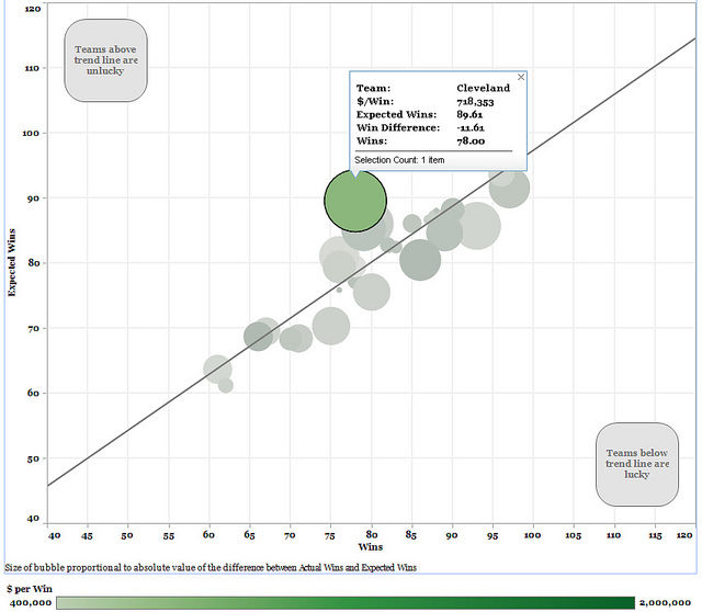
The data is visualized through three dashboards. The first visualizes the relationship between run differential (RunDiff) and OPS differential (OPSDiff) as well as the cost per win for teams. The second visualization looks at expected wins and actual wins through a scatter plot. The size of each team’s bubble represents the absolute difference between their actual and expected wins. Teams lying above the trend line were less lucky than their counterparts below the trend line.The final tab in the visualization presents relevant data in table form and can be sorted and filtered along a number of dimensions.
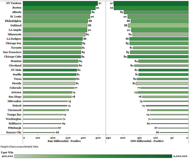
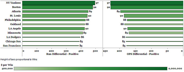
The first visualization lists all 30 teams and provides their RunDiff, OPSDiff, wins, and cost per win for 2001-2010. The default view lists the averages per team over the past 10 years, but you can select a single year or range of years to examine averages over that time frame. The visualization also allows users to filter by whether teams made the playoffs, were division winners or wild card qualifiers, won a championship, or were in the AL or NL. The height of the bars corresponds to a team’s wins (or average wins a range of years). The color of the bars corresponds to a team’s cost per win–the darker green the bar the more costly a win was for a team. Total wins (or average for a range of years) is listed at the end of each bar. In order to create the bar graph I normalized the run and OPS differentials data (added the absolute value of each score + 20) to make sure there were no negative values. For the decade, run differential explained about 88% of the variation in wins and OPS differential explained about 89% of the variation in run differential.
The visualization illustrates the tight correlation between RunDiff and OPSDiff, as the respective bars for each team are generally equidistant from the center line creating an inverted V shape when sorted by RunDiff. In terms of average wins over the decade, there are few surprises as the Yankees, Red Sox, Cardinals, Angels, and Braves round out the top 5. However, St. Louis did a much better job at winning efficiently, as they paid less per win than the other winningest teams (<$1M per win).
There are tons of ways to manipulate the visualizations and cut the data. Hopefully viewing the data in this way is helpful and illuminates some things we didn’t know and drives home other things we had a hunch about. This is my first attempt to visualize this data, so please feel free to send along any and all comments so I can improve it.
Author’s Note: Due to a very helpful comment by Joshua Maciel, I have updated the visualization. Here is a link to the original version for those that are interested.

Petti is Associate Director of Insights and Analytics at Alexion . Previously, he served as Lead Data Scientist in the Decision Sciences group at Maritz Motivation and a Global Data Strategist and Subject Matter Expert for Gallup.

0 Comments