As I noted last week, for the final project in my linked seminar this year, my students have to design and launch a website to promote their fictitious human rights NGO. In prepping for the course and in developing the grading rubrics, I’ve spent quite a bit of time reading the literature on what makes for a strong and effective website and how to integrate design, functionality, and content. My students’ websites are evaluated on all of these aspects. The content and text should match the sophistication of the targeted audience — generally it should be smart and focused. The aesthetic should include visual appeal, professional appearance, color harmonies with elegant and clear and easy to use design functions to visually guide readers through the content.
All of this makes me wonder what the hell are the folks at Foreign Policy.com thinking? There is still some decent content in there. But, I simply can’t access it — not because I don’t have a subscription — I ponied up the cash for the new monthly fee after the new site and pay wall was rolled out earlier this year. I can’t access it because visually it’s simply too overwhelming with an overload of text and images that often are nested on top of each other — why even have pictures that are obstructed by blocks of text? There is very little open space and there are incredibly sloppy design and graphic features with random pop-ups. Navigating the site is difficult because even after following a link to a story, the page is littered with right and left bar text — its not easy to see where one story ends and another begins. This screen shot is from this morning:
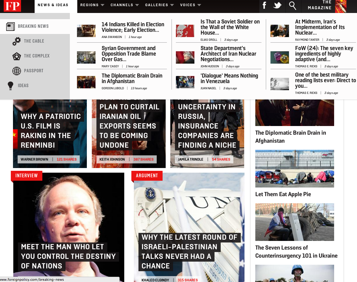
I also have trouble accessing the content because I have an instinctive aversion to check-out counter celebrity magazine formats — filled with titillating and sensationalized headlines. Seriously, who is the target audience for all of this? Today we get a headline on a “five step program to fix Ukraine.” Glad it’s so easy. We get this headline: “Russia is an Arsonist Pretending to Be a Fire Inspector.” Wow, that’s insightful. And then, there’s this gem — apparently Claire Shipman and Jay Carney from Washington’s “B-list celebrities” have Soviet propaganda posters on their walls at home — the same home in which they are raising nice, well-fed children.
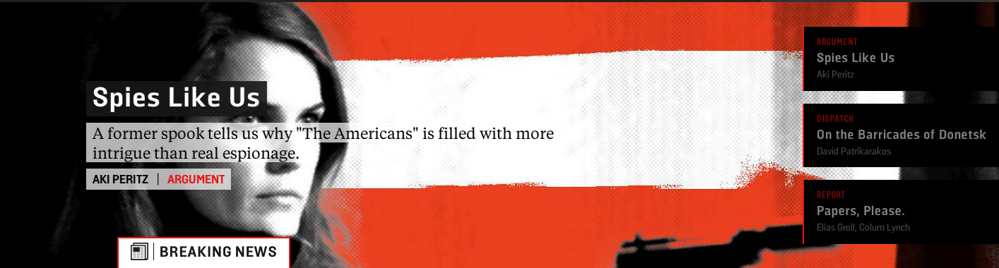
The lead banner this morning was particularly bad. A former “spook” tells us that a tv show is more intrigue than “real espionage” — you think? On top of that, there are blocks with gray and red text over-laying a black background. It’s illegible.
This is all very unfortunate. I used to rely on content in FP to help trigger some discussion and debate in class. This week I’m relying on the technology fail of the website to illustrate what not to do.
If one gets past the inane headlines and some of the really dumb fluff pieces, there is still some decent content –even after departures by Dan Drezner and Marc Lynch. Maria Stephan has a nice piece on the role of non-violence and civil protest. The Channels still provide a nice range of insights. Steve Walt, Tom Ricks, David Bosco and Column Lynch can always be counted on to have interesting updates. But, the overall aesthetic of the site coupled with some pretty pathetic pieces and titillating headlines really does a disservice to these more sophisticated contributions.

Jon Western has spent the last fifteen years teaching IR in liberal arts colleges at Mount Holyoke College and the Five Colleges in western Massachusetts. He has an eclectic range of intellectual interests but often writes on international security, U.S. foreign policy, military intervention, and human rights. He occasionally shares his thoughts about professional life in liberal arts colleges. In his spare time he coaches middle school soccer, mentors the local high school robotics team, skis, and sails.

Not to mention that horrible mouseover thing that appears Every. Single. Time.
David Rothkopf strikes me as a specialist in fluff. Years ago , he and Dan Drezner were on a show on TV Ontario, the moderator Steve Paikan, pointed out that while Rothkopf had been speaking Drezner had been rolling his eyes. (Both were on satellite feed) Rothkopf was visibly upset. Drezner deserves some kind of retrospective merit raise for that moment. I was reminded of this when he had a twitter exchange with Drezner over Kristoff’s column regarding political science.
I agree! I simply miss Foreign Policy. A real loss.
Ugh, agreed. Layout giving me such a headache I can’t even consider the content, if there is any.
Yup, I’m glad someone’s writing about this. Rothkopf’s next big idea: a mega merger of foreign policy, buzzfeed and upworthy.
If you want the content without the UI, just use the RSS and get it delivered in whatever format you want. They have a nice collection of feeds, so you can even filter the fluff down to the authors and columns you want.
https://www.foreignpolicy.com/node/33012
Jon, I joined right around same time as you. I logged on, some kind of menu or ad or doodad dropped over the page, a banner went whizzing across, about six slides appeared. Then I found an article that I wanted to read. After clicking on the article, the text was illegible and the font was a nursing-home-friendly 36 for some reason. I hate listicles. And the cartoonish mug shots are cute on the A1 section of the pre-Murdoch WSJ when it visualizes the subject of the feature, but are faddish and silly for contributing writers. I haven’t logged back onto FP.com since. Maybe once they streamline their site I’ll enjoy the fruits of my subscription.
It has more problems than that. There are swarms of scripts (generally at least twenty-some), most of which probably just to track you, that I have to look at and choose whether or not to allow through AdBlock, with no idea which ones are the ones needed to comment on a post and which ones are best kept away from my computer.
The Livefyre system used seems to have made it impossible for me to go through my older comments and personally I didn’t even like it beforehand. If that wasn’t enough, I can’t even use Google to try to search for my comments myself. It was headaches like this that led me to just stop trying to comment on the site altogether. Even worse, as far as I can tell it took them at least weeks, possibly much longer, to take down an anti-Semitic comment I emailed them about circa spring last year (LiveFyre was outright useless when I flagged it).
Because of how articles pop up it’s easy to go past your eight a month limit if you’re trying to do something as simple as go to the comments and you accidentally scroll down too far (it’s just as sneaky and infuriating as The Economist’s tendency to put up articles that just tell you there’s an article somewhere else on the site, which means that you’ve lost two of your three free articles just to read a single article).
The site seems to have an interesting idea of what my limits are, since when I went to my eighth article for this month, the moment I allowed scripts through to try to comment it instantly gave me a message telling me to subscribe, and when I clicked it away it instantly sent me to the front page. So in reality I’m given seven pages, and the opportunity to pay for an eighth.