This is a guest post from Bear Braumoeller, Professor of Political Science at The Ohio State University. Follow him on Twitter @Prof_BearB.
Graduate study in the social sciences is overwhelmingly oriented toward the process of researching and writing a dissertation that will become a book. We very rarely talk about any other aspect of publishing—how to approach an editor, how to design a book with a specific audience in mind, or how to (gasp!) market a book.
The latter topic came to mind recently when Professor Matthew Shugart complimented the cover of my forthcoming book and asked what the story was behind it. That question prompted enough discussion that Josh Busby asked me to go into in more detail in a post for Duck of Minerva, in case the answers are of use to other authors who are facing this question.
First, you should be aware that an editor will typically ask for cover image ideas early in the process. No one knows the book as well as its author, and even though researchers are often not the best designers, we can often give a sense of the idea or theme that best captures what the book is about.
In my case, I was trying to capture the idea that, contra conventional wisdom, war is not in decline. I’ve already written one book, and knew that I’d be asked for cover images, so I started looking early and grabbed any image that I thought might work. Any time I found an image, I saved it in a directory along with a .webloc file that I generated by dragging the URL from the browser address window onto the desktop. Keeping a text file with website URLs would work, too, of course. The important thing is to keep a record of where you found the photos so that, if the press decides to use them (or someone asks you to write a blog post about them!), you’ll have that information right at hand.
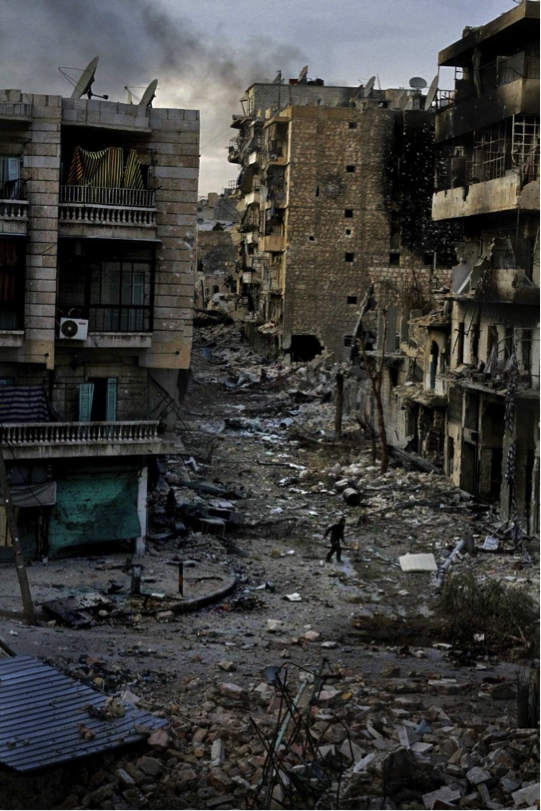
The first images I came up with weren’t great. Some of them, like this photograph of the siege of Aleppo by Javier Manzano, conveyed the idea that this was a book about war, but they didn’t really say much more than that. A shot of a present-day conflict also made it seem as though it was more of a book about current events, which it is, in part, but it also looks back at wars and conflicts over the last 200 years.
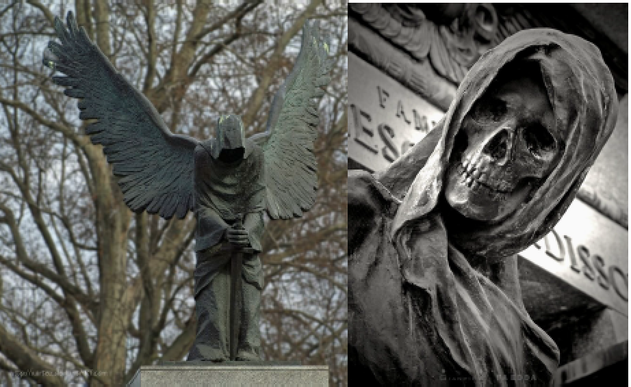
Other photographs I grabbed, like these sculptures from the website Deviant Art, focused more on sadness and tragedy and death. I did want to convey tragedy, because some of the book’s conclusions are really pretty awful. But in retrospect, these grim subjects, however appropriate, aren’t exactly the sort of thing that makes people excited to buy a book. Unsurprisingly, Oxford didn’t select any of the ones in this category.
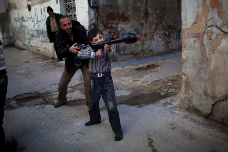
After that dead end, I started thinking about how I might capture the idea that war persists. This photo, of a Syrian man teaching an 11-year-old how to use a toy rocket-propelled grenade, captured the idea that war persists across generations. But as the father of a young child myself, I found it almost unbearably awful to look at. Also, as Dave McBride, my awesome editor, pointed out, realistic photos of people tend to send a subliminal signal that this is a current-events book rather than a book that is meant to have more lasting relevance.
I did ask about using photos that included actual dead people, because they kept cropping up in my searches. As I suspected, it’s a no-no for many very good reasons. Unless it’s a photograph of a close friend who wouldn’t have minded helping you sell books, don’t even think about it.
Once I’d submitted the first batch of ideas, I went back to work and more or less forgot about the cover until I got the first two preliminary designs back. I wasn’t really thrilled with either one. The first, based on a drawing that I found posted online without attribution in a half-dozen places, was just ok—the composition seemed like something I could have done, and for whatever reason it just didn’t speak to me. The second used an image I hadn’t suggested and didn’t convey much at all, except combat (and again, modern combat).
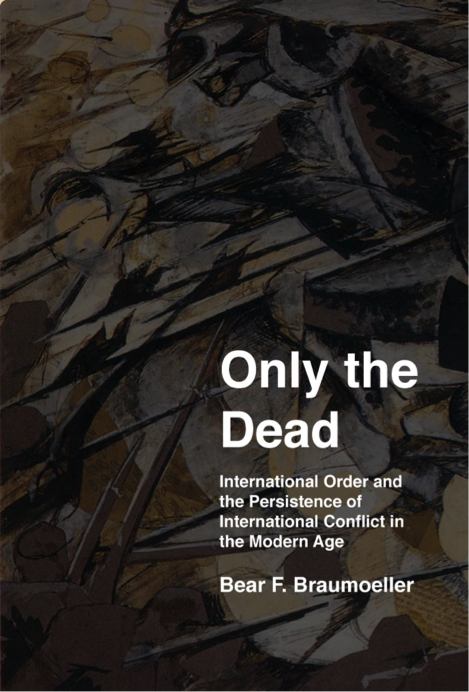
Chagrined, I decided to try my own hand at designing something, even if it wasn’t something that Oxford would want, just so that I could get a better sense of what I wanted to convey. I went back to one of the more abstract representations of war that I’d found, Umberto Boccioni’s Charge of the Lancers, and tried to see whether I couldn’t put together something I liked better. (I also thought I’d try out a revised and much wordier subtitle, which Dave, again wisely, later steered me away from.)
The results were… not great. I could tell that it lacked something, but what that something was, I hadn’t a clue.
I started to come to grips with the fact that maybe, just maybe, I really suck at this. So I ran my early ideas past my wife, Kristen Schmidt, who’s spent a good part of her professional career choosing images to go with publications. She gently confirmed that I do, indeed, suck at this. But she also told me why. She said that I was being too literal—that I was trying to choose an image that would convey what the title and subtitle were already conveying. Most images aren’t good at that. What they are better at is conveying moods that complement the title rather than repeating it.
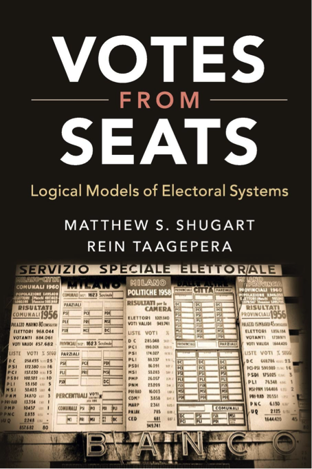
Now, there are some exceptions to this generalization. A good example (especially since his tweet prompted me to write all of this!) is Professor Shugart’s book with Rein Taagepera, titled Votes From Seats, the cover of which depicts an Italian election board—literally a tallying of votes and seats. To my mind, though, its attraction is only partly due to the depiction of the tally: to me, it also evokes the feeling of people on election night, standing on the sidewalk below the bank building, watching in excited anticipation as the results are posted.
The broader point, though, is that academics need to talk to smart, thoughtful non-academics once in a while, especially when it comes to conveying things to people who aren’t academics (or who are academics, but not in our field). We overthink things—it’s sort of our brand—and we tend to forget that potential readers are also human beings. They respond to images that engage their feelings, however subtly, as well as their minds.
So, back to the drawing board I went. One of my wife’s suggestions had been to look for covers that caught my eye, and I thought the book room at ISA was a perfect place to go browsing. I strolled from one stall to the next and snapped photos of the books with cover art that grabbed my attention. Here’s a representative sample:
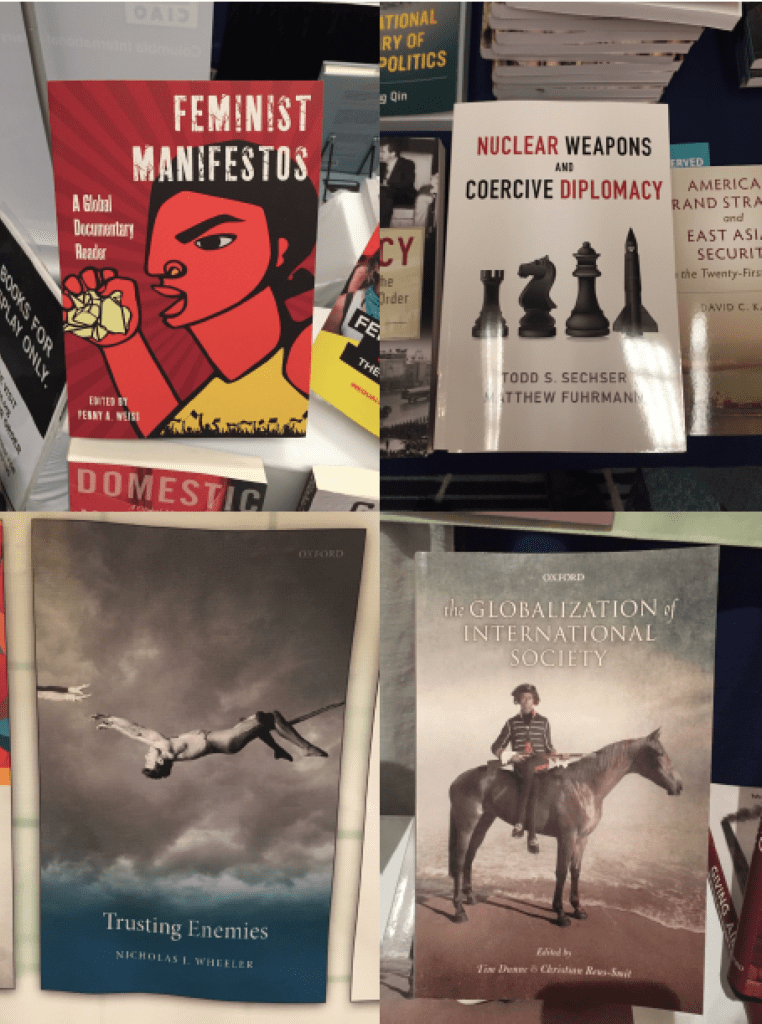
Each caught my eye for a different reason. Feminist Manifestos popped out visually, and the artwork was fitting to the subject. Nuclear Weapons and Coercive Diplomacy used chess pieces to signal that the book was about strategy, which admittedly is hardly original, but slipping a nuclear weapon into the lineup was clever, and the clean, minimalist design stood out. Trusting Enemies was without a doubt my favorite: the man on the trapeze reaching for hands that he might or might not catch above the deep blue of an apparently faraway ocean instantly made my gut churn, and the storm clouds in the background made the scene look not just risky but ominous.
Finally, in the cover art for The Globalization of International Society, an Indigenous Australian is dressed in the period clothes of his colonizers. The resulting subtle oddness made my eye linger on the cover longer than it otherwise might have and gave me the sense—correctly, as it turned out—that the book was an attempt to give non-European societies their due in a reimagining of its obvious inspiration, Bull and Watson’s The Expansion of International Society. Each cover image was relevant to the theme of the book, but the connections were often more indirect and creative than one might think.
When I got back, I kept digging, trying to keep an open mind about how exactly an image might connect to the theme of the book. Before long, I hit a gold mine—the Department of Defense’s annual photo competition, which honors the best military photography every year. Check it out—the photos are pretty amazing. Paging through one year’s finalists, I came across this one: ‘Reflection in a Pond,’ by Staff Sgt. Marianique Santos, USAF. I loved it.
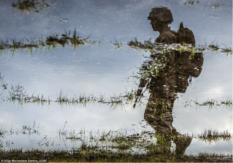
Here, it’s worth mentioning another useful piece of advice that Kristen had given me. She’d told me that I shouldn’t just send photos to Dave and ask, “What do you think?” I should also explain to him why I liked the picture—what it was about it that grabbed me and made me feel as though it was appropriate for my book. That turned out to be a harder exercise than I’d anticipated. But after staring at the photograph for a while, I wrote the following:
I like it because it captures a lot of feelings that I think fit pretty well here. The overall composition is somber. The reflection in the water gives it a subtly ghost-like quality, while the fact that the soldier is just walking—an ordinary, everyday activity—underscores the extent to which we’ve normalized something that should be horrible and abnormal. The tufts of grass add to the contrast by evoking barbed wire (to me, at least) and fracture the image in ways on which the eye tends to linger.
Dave agreed immediately. In short order, the designers had done their thing and we had the final cover at the top of this post.
Lessons Learned
After all that, what are the lessons I came away with about this process?
- Budget time to look at lots and lots of images. The goal is to get the best cover you possibly can, and that may take some time and cause some frustration. That’s OK.
- Keep track of where you found images and, if at all possible, who created them. You’ll need that information later.
- The cover image and the title should complement one another. The title and subtitle tell you what the book is about. The cover image can, but it doesn’t have to, or it can do so indirectly, by conveying a mood or a feeling. Consulting family and friends, especially if they happen to be experts, can be a huge help.
- Look at books like yours with covers that you like and ask yourself what the cover art does and doesn’t do.
- Don’t just send images that you like to your editor—explain why you like them. Forcing yourself to answer that question can help to separate good ideas from bad ones, and it ensures that the editor is at least aware of what you see in the image.
- Work closely with an editor you can trust. Dave McBride at OUP was terrific throughout this process. An editor’s job is to edit—to sort the good parts from the bad parts. Let them do their jobs, and don’t be upset if they tell you that 90% of what you propose won’t work. They publish a lot of books, and they’re probably right.
- Don’t be afraid to pass on cover drafts that don’t work for you. The book is yours. You most likely put years of your life in it, and you’re going to be looking at that cover for the rest of your life. Make it one that you’ll be proud of.

Joshua Busby is a Professor in the LBJ School of Public Affairs at the University of Texas-Austin. From 2021-2023, he served as a Senior Advisor for Climate at the U.S. Department of Defense. His most recent book is States and Nature: The Effects of Climate Change on Security (Cambridge, 2023). He is also the author of Moral Movements and Foreign Policy (Cambridge, 2010) and the co-author, with Ethan Kapstein, of AIDS Drugs for All: Social Movements and Market Transformations (Cambridge, 2013). His main research interests include transnational advocacy and social movements, international security and climate change, global public health and HIV/ AIDS, energy and environmental policy, and U.S. foreign policy.

0 Comments